
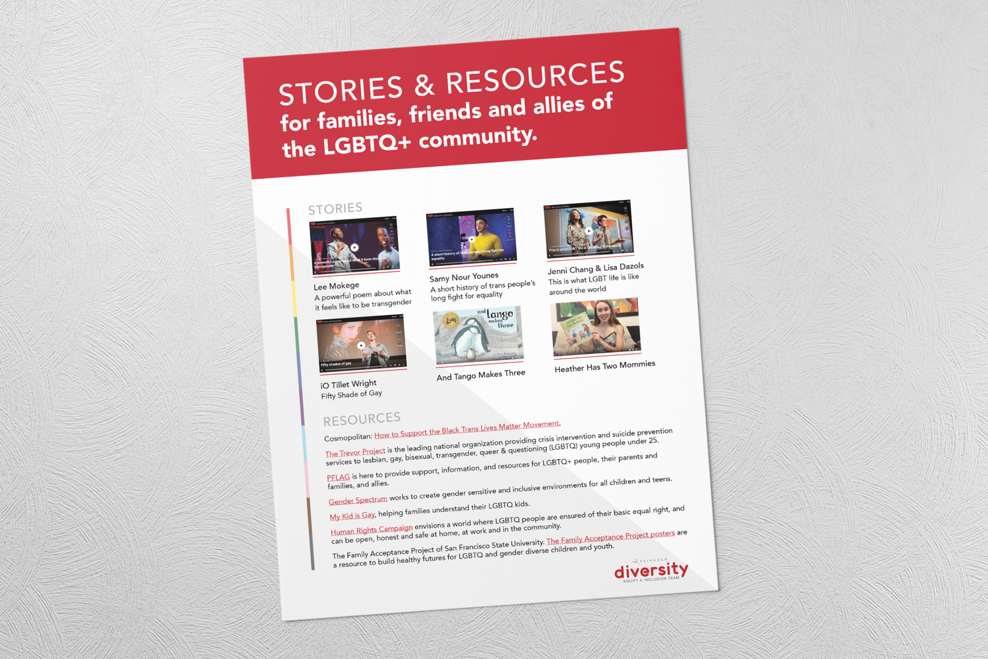
Above is a graphic that was sent to the entire team at Reingold during pride month. The purpose of this was to provide the people of Reingold stories and resources that'll allow them to learn more about the LGBTQ+ community.
As I was designing, I wanted to add the LGBTQ+ colors into the graphic somewhere. Therefore I included that design element you see on the left side, the vertical line that consists of the LGBTQ+ colors. This allows the graphic to be more engaging and more appropriate to its purpose.
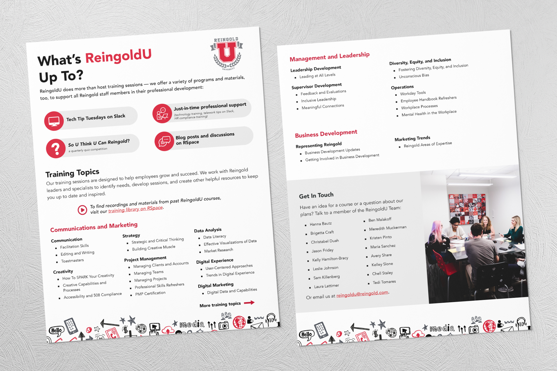
The purpose of this graphic was to inform current and future employees of Reingold what ReingoldU has to offer. ReingoldU provides training and programs to the employees at Reingold to develop and grow in the company.
In the making of this graphic, there was a lot of content that needed to be fit into the given space.
I was able to include all the text that was needed while also introducing design elements/images/icons to create a more engaging graphic. While also giving all the information an amply amount of space in between them so the page isn't overly crowded.