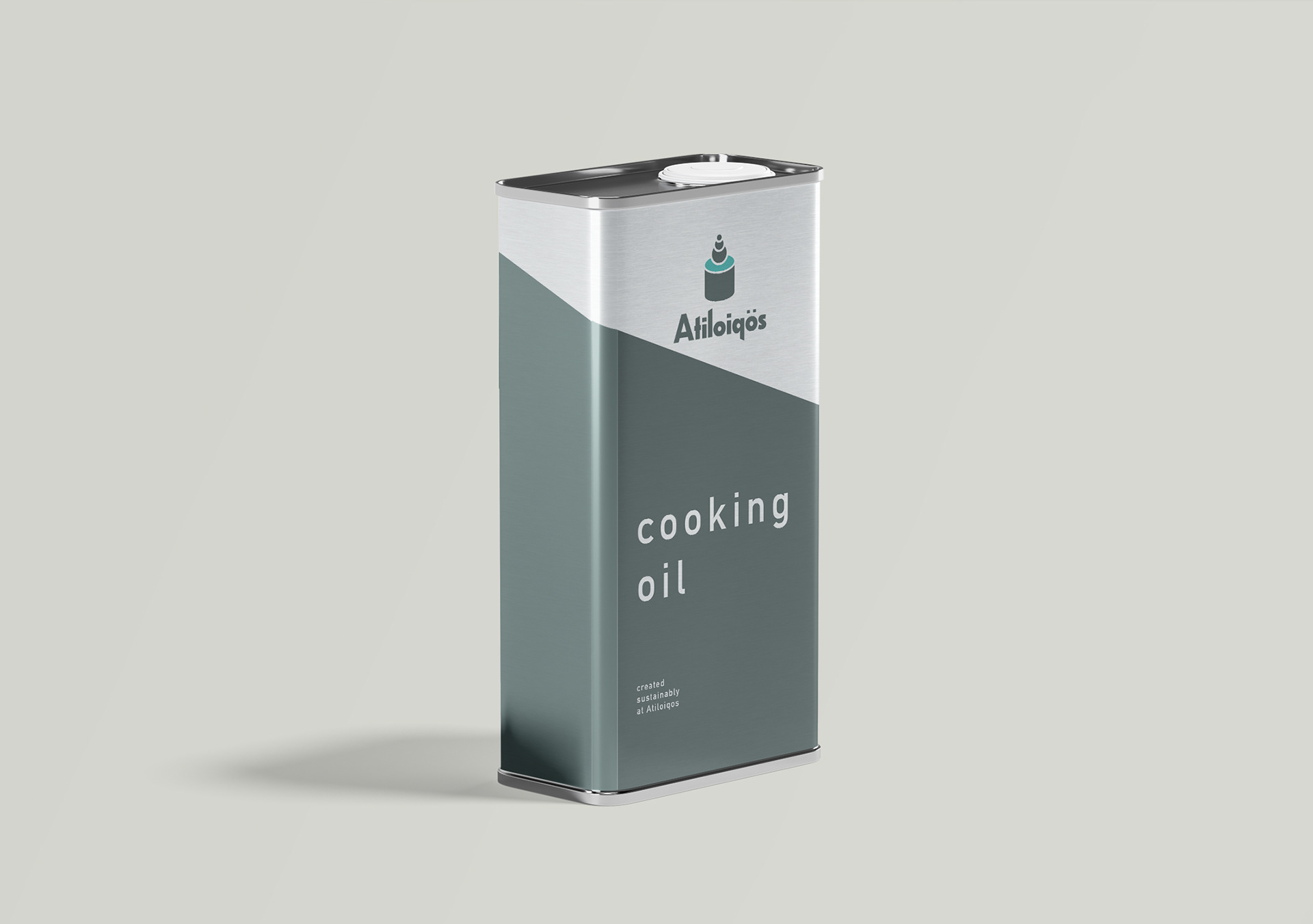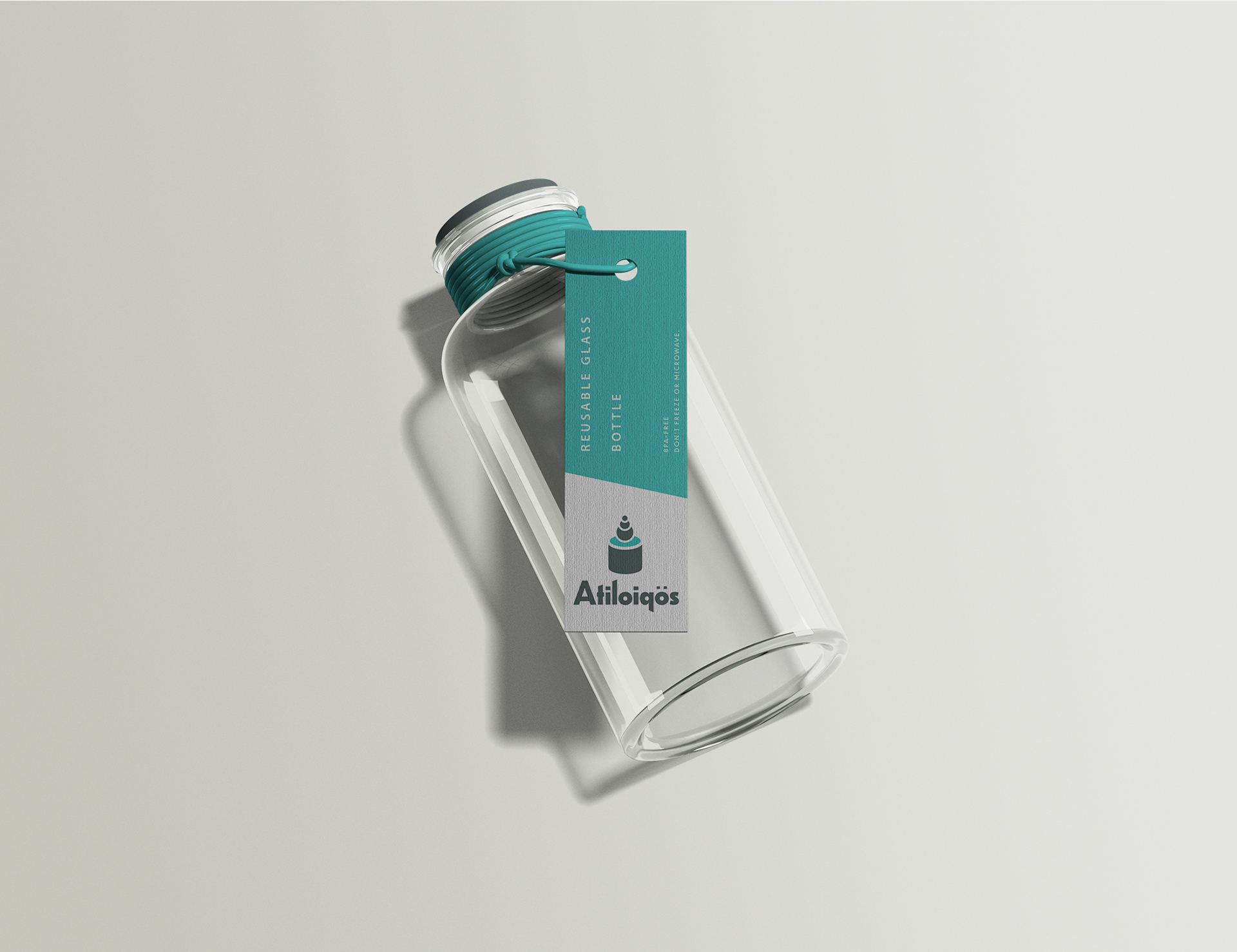


I begin sketching over a hundred potential logos and landed on this one you see now. The three circles on top represents an oil droplet while the cylinder underneath represent an oil canister. When it comes to choosing the colors for the logo, I chose to stick to a mellow gray/green and a bright teal. Something different than the typical red and orange colors that other petroleum companies use.
When the overall branding is complete we were then tasked to create ephemera and stationery for the company.
